Ok... so i felt guilty to leave it on a limb like that, so instead I'm going to fill you in what it is exactly I'm stressing so much about.
Basically our brief was:
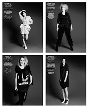
To create a trends package branded within a trend prediction consultancy. As a team project, we have to confirm four complete key trends of socio-cultural relevance impacting on fashion trends for 2012.
so... Here we have our trend consultancy Agency, Volume II (www.vol2.co.uk) named volume II on the premise that volume I is 'now' (present time) and as a predictions agency we are looking ahead, the next chapter so to speak, therefore we are Volume II. This here is our logo and part of our branding, it would be great to get some feedback on this... We are currently working on our website and should hopefully be live in a few days but in the mean time why not check out our twitter page and follow us & our updates to get a sneak peak at our trends for 2012.
below are some of my original/ draft ideas for some possible 2012 trends:
Could the Apocalyptic theme be a continuing trend? (please not these were done in early Oct)
Reversal was the idea that Post Olympic population growth that London city living will adopt a NY lifestyle. This board however was combined with another trend which makes it slightly confusing- Salvage, the idea that items would have multiple identities and transform
These however are not part of our final trends package as we moved into consumer trends, please check the website from 1st Dec (when hopefully it should be live) or checkout our twitter to keep updated
Sorry it's that time of year, deadlines are here!!!! (cue the scream... arrrggghhh!) so my lack of posting of late is due to me piled under, books, books and more books, newspapers, sketchbooks, photocopies, glue you name it....
and when this is all over your be sure to know about it.... they'll be thousands of postings. but until then I'm officially going to set up camp in the library ... bye for now x
Since gaining a fashion design degree at UCE in Birmingham, Claire has been involved in a number of creative and womenswear design-based roles and projects. She established a womenswear design collective and retail space, which culminated in running her own womenswear and accessories label No Dice.
This space was rented for a 6month period in Birmingham city centre, Claire along with her partner in the business sold vintage clothing, as well as securing some designer labels to sell alongside her own collection. This was a major learning experience for Claire and she believes it not only helped her develop as an individual but learnt about financing, buying, marketing, press, womenswear and accessories. With this knowledge she moved her collection to Manchester to embark on a 2-3 year long project. She had a shop and a market stall where she sold her collections seasonally and was gradually building contacts.
Claire also did freelance styling and journalism on the side and her main advice is: “Put yourself out there, Make as many contacts you can!”
Her work experience background was the most inspiring as she did a stint at i.D magazine and in the press office at YMC which allowed her to get an understanding for the different levels of the industry especially in Press and Editorial. It is ironic she had experience in editorial and PR as the WGSN office was described by Mark Tungate as similar to a ‘bustling editorial floor of a major newspaper with dozens of journalists tapping away at keyboards.”
However securing her position at WGSN was not a walk in the park, she had heard of the position from a friend who recommended her to it. Before her first interview she had to write a trend report, which then secured her the position as associate editor accessories, and footwear, which she has now been doing for three years.
WGSN has many different levels to the company including trend analysis and future trends, which Claire is responsible for contributing to each section in her specialized field. Time scales for each project varies and Claire can often be doing 3 reports a week along with the help of commissioning freelance and international contributors.
The London Headquarters currently has 100 people as part of the global WGSN team, which stretches to L.A. New York, Japan and Melbourne. It is important for them to have a grasp of what trends are happening around the world. They will often have assignments which requires them to visit a location whether it be home or abroad and then collect all findings from that city- street style, exhibitions, architecture, shops, films, magazines, events and report this all back to the team in form of a presentation. It is important for WGSN during these tough economic times that they report on worldwide highlights and trends as it is now believed many designers/ creative’s do not have the budget to do so themselves.
Claire had recently in June this year spent 5 days in Melbourne and 3 days in Sydney. She took an in-depth look at Australian Art, music, fashion and style and it was interesting because of the seasonal difference, 6 moths behind. Claire picked up that the street style was transitional and laid back casual. There was also a grunge aesthetic very D.I.Y 90’s feel. They had community Zines for the creative’s, and appeared to have a massive vintage obsession with well-kept specific shops. Punk street art was exposed through graffiti. The art scene there is very unique and everything is customized from t-shirts and sneakers to make shift galleries. Alternative music venues and gigs with bands called Bridezilla, red riders, SPUNK & Lions at your door.
A Levi’s initiative, which was a real world game and mobile treasure hunt, designed to get people talking about, and wearing Levis again. Hundreds of pairs were ‘released’ on to the streets of Australia and New Zealand, worn by Levis representatives. Twitter users could piece together clues (online or via their mobile) to locate the jeans and instantly win a pair by asking the wearer “Are those Levis?”. If they got it right, the person wearing the denim had to drop their pants, and hand over the jeans on the spot. The campaign generated plenty of PR and also satisfied Levi’s sampling requirements by getting the denim into the hands of the target (and vocal) demographic.
Claire’s role at WGSN means it is essential that she keeps up-to-date with blogs, music, films and street style (markets being her best hangout) and she will give weekly presentations back to the team.
WGSN look at seasonal trends 18months ahead, each trend pack includes 3 trend concepts, which has been devised by the team on the basis of an overall common theme. They will often get technology experts to come in and in and inform them on the latest equipment or developments, which may influence future trends. When developing items they tend to use a USEFUL method of going back to basics creating moodboards. The colour teams whom work 6 months ahead respectively will work with them to bring the overall concept together. When putting together a trend they will write details of the products listing where it has come from and where this may be developing. Under research & reference they picture all the influences, with illustrations and which turn into online downloadable pages.
WGSN not only keeps up to date with consumer needs but also recognizes the needs of there own customers (clients) they are aware of the industry budgets and have close links with marketing & PR teams worldwide. Revenue is created through subscriptions (around £2500) and they find that their consumers are quite vocal with their expectations and feedback. Being exclusively online allows them the advantage of being instantaneous and they are able to work in between seasons as the industry is becoming less seasonally defined.
What’s coming up for Claire herself?....
Looking towards sustainability and communication and also writes for the Guardian, she hopes to keep these external interests open. Also involved in consultancy which is mainly through her existing role she is currently working with Blackberry looking at potential accessory possibilities
30.10.09
FashionIn Film
INTERVAL
Director/ Jamie Isaia @ Art + Commerce
Designer/ Hussein Chalayan
Cinematographer/ Andreas Von Scheele, Stephen Blaise
Editors/ Catherine Camille Cushman, Jamie Isaia
Stylist/ Ben Sturgill
Makeup/ YukaWashizu
Hair/ Wesley O'Meara
Models/ Ali Micheals @ DNA, Daria Strokous @ IMG, Olga Maliouk @ Marilyn
Print Editorial media is so passé these days and what with the economic climate and restrictions designers areexperimenting with creative flair and new media. Film is being used as a substitute for catwalk shows which means it is far more cost efficient, and allows a wider audience to experience it.
Film medium gives designers another tool to express themselves, offering another dimension.
The influences, thought process, and narrative a designer was working with for a collection is revealed and exposed with their control.
ErwinBlumenfeld
1950’s – film experiments (One, Two and Three) were produced for Vogue and HarpersBazzar. They were extremely innovative for the time, different angles, techniques, Colours and camera effects which Blumenfeld experimented with over the 6 years towards the end of his life. They had a poetic nature to them.
FILM EXPERIMENTS IN ADVERTISING: Given Blumenfeld’s antipathy towards his reputation as a commercial artist, advertising films might seem a strange addition to his archive of imagery. Started in 1958 and spanning six years until 1964, the photographer’s cinematic experiments were prompted by the rise of perhaps the greatest commercial force of the century –television. Feeling frustrated with early, rudimentary television advertisements and convinced he could better them, Blumenfeld set about making film tests to show to his biggest clients Helena Rubenstein, Elizabeth Arden, Dayton’s department store in Minneapolis and L’Oreal.
Close examination of the approximately twenty-five minutes of existing footage reveals that Blumenfeld’s adventures in moving image were anything but mundane corporate fodder, however. To begin with, they were strictly amateur in production. The photographer was a great cinema enthusiast and loved the work of Charlie Chaplin. Upon moving to Paris in the mid-1930s, he worked as a stills assistant to the French filmmaker Jacques Feyder, around whom he learnt enough to master the 16mm medium when working alone. Just as he adored experimenting in the darkroom, Blumenfeld’s son, the writer YorickBlumenfeld recalls him enjoying the dogged toil of splicing together film strips to craft simple edits.
Neither was Blumenfeld’s mode of creative expression strictly commercial. The tactics and aesthetic appearance of advertising plays only one part in a rich holding of moving imagery that focuses also on stylistic formations in contemporary art, notions of beauty and their application to the photographic shoot and many of the formal devices present in perhaps his strongest photographic period, from the 1930s and 40s. It is in this latter body of work that the photographer reveals himself to be most seduced by the artistic potential of moving fashion imagery, as if proving to himself it was capable of all the sophistication and intellectual aspiration he found so lacking in advertising.
Extract from Show Studio
GuyBourdin
Guy Bourdin’s films have complex exotic narratives. Vivid colours are synonymous with his photography and they are still apparent in film collectives. They are fragmented moments conducted in video graphical way which build up layers and communicates a visual language in which the audience is invited to interpret.
Guy Bourdin and Richard Avedon are photographers who in my mind are revolutionary geniuses with there film experiments and photography techniques. They set the standards for today’s fashion photographers.
Below is the playlist of the fashion films which were shown at Show Studio Revolution at Somerset House.
Beyonce Sweet Dreams video more than took influence from British design protégé Gareth Pugh- She is also wearing his designs.
Gareth Pugh Launched this art expression film in tandem with his show during Paris Fashion Week, the film was created in collaboration with Ruth Hogben, which showcases the designer's Autumn/Winter 2009 collection. It received a great response, as this was risky territory for a relatively new conceptual designer. The sequence has a sci-fi aesthetic, which mainly focuses on the shapes and silhouettes of the garments, moving, transforming and interchanging. This is a cinematic performance rather than a catwalk is expressing a new visual language. Pugh when asked if he will present in this format in the future he was documented saying that this type of fashion presentation 'depends on what is right for the collection'.
This reminded me of Viktor & Rolfs s/s 2009 digital online catwalk- is this the future was echoed after this controversially was released purely only as an online format. When i first watched this full length (there is an introductory bit before this where Shalom Harlow runs into the dream like grand hallway) I was taken back at how amazing it looked! at a fraction of the cost of a full runway production and eco- friendly links it was only before time this was done, and i was glad it was my favourite duo who broke the mould as they always do and pulled this out of the bag!
Maison Martin Margiela - Make Up Your Mind
This has to my favourite Fashion collab video which I can't help but smile at- all the features such as the infectious sound track, amazing Masion Martin Margiela
Wig Coat!!! are all amazingly produced again the legend that is Nick Knight for show studio.
Prada "Fallen Shadows"
08/09
animation artist Penny Martin created this for prada with very obvious surrelism refrences such as Salvador Dali
Superflat first love by Takashi Murakami for Louis Vuitton.Another feel good short animation where Luxury brand Louis Vuitton attemots to engage a new audience with this wacky creation.
All this information was presented to me as a Lecture on 29.09.09 by Fran Coombs whom was involved in the Fashion Film Festivalwhich brings together filmmakers and artists who create moving images and they expose forgotten hidden gems such as
I have a bit of a nosey streak when it comes to peoples homes and exploring there interiors. Therefore I absolutely loved flicking through the beautiful images of the pages of this superb book, (right).
I think London Style is indeed the most intriguing with a mass of creative individuals living door-to-door and the interiors of their homes reflect their individual personalities (especially Matthew Williamson's Home in Hampstead below). A Home is a retreat, a sanctuary where people surround themselves with precious items, I think the design and interior of the home is another extended perspective of who lives there.
West London I think suits my style and taste best and It is my dream one day to live in a beautiful Georgian house in W10/11 with a gorgeous interior similar to the ones below, French boudoir furniture with distressed chic! And Fireplaces oh how I would love to have a fireplace in my bedroom! well we can all dream can't we...
New London Style takes a fresh look into the private dwellings of the most exciting young creative talents in the city, from the music, fashion, design and art worlds. This new London style takes many forms, but above all it expresses a creative sensibility against the backdrop of the ever-changing environment of one of the worlds most exciting cities. The 28 houses in the book are loosely arranged by location, in the grooviest, on-the-edge neighbourhoods fromWhitechapel to Notting Hill, Camberwell to Clerkenwell and reflect the cosmopolitan melting pot that influences the citys design trends.Whether in a mews house, derelict pub, or even a church, this new wave of lively Londoners is injecting funkiness and bright ideas into a range of highly individualistic and inspirational interiors.
very true) and I'm going to just prove it and attempt to post up as much of my work, findings, research etc..... up!
So the other week I had a bit of a London Day, went to show studio (I'll post later) then onto Mode Information for a little talk on the trend publications they hold and then through the rain down to Southbank to see the new Tate Modern exhibition- POP LIFE
Must admit after paying a whopping £11 or so for a ticket I was expecting something pretty amazing, for it to be curated well with dynamic a modern displays and be able to leave clued up on all thing Pop art ready to curn it out for my pop culture essay, sadly it didn't tick any of those boxes. After going to such an interactive and boundary pushing 'show studio' exhibit in the morning this may have something to do with my slight disappointment. Surely the Tate Modern should be at the forefront of taking art and interaction, with digital displays to the next level but they seem to be flagging behind!
I apologise Mr Warhol, and this is only an opinion but seeing your work on google images looked not that much different to when they have repeatedly plastered all over the walls! I'm not sure what it was but the exhibition seemed to lack substance, there was no interesting dialogues or facts to be learned and as these are POPULAR, ICONIC images which we are all very aware of it would of been nice to have been surprised in some way! So to see them plainly with a name plate stuck underneath did not give the viewer any other deeper perspective of the works or artists behind them. I would be interested to know if others who have been would disagree with my account. Either way i can't be completely negative watching peoples careful expressions with a slight head nodding and side glancing in the 'strictly Adult viewing Rooms' filled with 20ft Jeff Koons Photo titled 'Anus' was quite amusing!
Andy Warhol- Mick Jagger (1975)
Acrylic and Silkscreen ink on canvas 101.6 x 102.6cm
Gavin Turk- Pop (1993)
Glass, brass, MDF, fibreglass, wax, clothing, gum 279 x 115x 115 cm
Gavin Turk- Cavey (1991-97)
Ceramic laid on concrete 48.25 diameter x 5 cm
Damien Hirst- Aurothioglucose (2008)
Household gloss and enamel paint on canvas 172.7 x 274.3cm
Damien Hirst- False Idol (2008)
calf, gold, glass, gold-plated steel and formaldehyde solution with a carrara marble plinth and stainless steel plinth
Andy Warhol- Self Portrait (1986)
Acrylic and screenprint on canvas 203.2 x 203.2cm
What amazingly talented individual. I love how he more or less branded himself as a sellable product and rarely spoke in interviews the man was a pure revolutionary genius!
Andy Kissing John Lennon (1978)
Vintage silver gelatin print 40.6 x 50.8 cm
Tracey Emin- Hotel International (1993)
Applique quilt 257 x 240 cm
Although i have always seen Emin as being slightly overrated i must say her work tucked away in the corner of the exhibition was one of the highlights and to see it in all its glory with the objects that filled her once west end shop you really could imagine the atmosphere and it told a great story!
Tracey Emin in bed, lying underHotel international, with Jay Jopling at the Gramercy Hotel, New York (1993)
Jeff Koons- Burgeious Bust- Jeff and Ilona (1991)
White Marble 113 x 71.1 x 53.3cm
Jeff Koons- Jeff in the Position of Adam (1990)
Oil inks on canvas 243.8 x 365.8 cm
Not quite sure what to make of Jeff Koons Sexually orientated work, Is it art? or is it trashy pornographic images? It's got controversial written all over it!
Martin Kippenberger- Bitte Nicht Nach Hause Schiken (please Don't send Me Home) (1983)
Oil on Canvas 120 x 100 cm
Elaine Sturtevant- Haring Tag (1986)
Sumi ink and acrylic on cloth 25 x 22.5cm
Pop Shop (1987)
Photo Charles Dolfi- Michels
The recreation of the pop shop with actual items for sale was interesting but could never come clothes to actual representing the original.
When I was a child I would escape to home-made dens or retreats, surrounding myself with all the things I loved and cherished…Kind of like what this is… My hideaway.
Issue 11 out now available to buy online or at various stockists including Magma Stores / Selfridges / Serpentine Galleries / Harvey Nichols to find a full list of stockist online at Volt Cafe..


